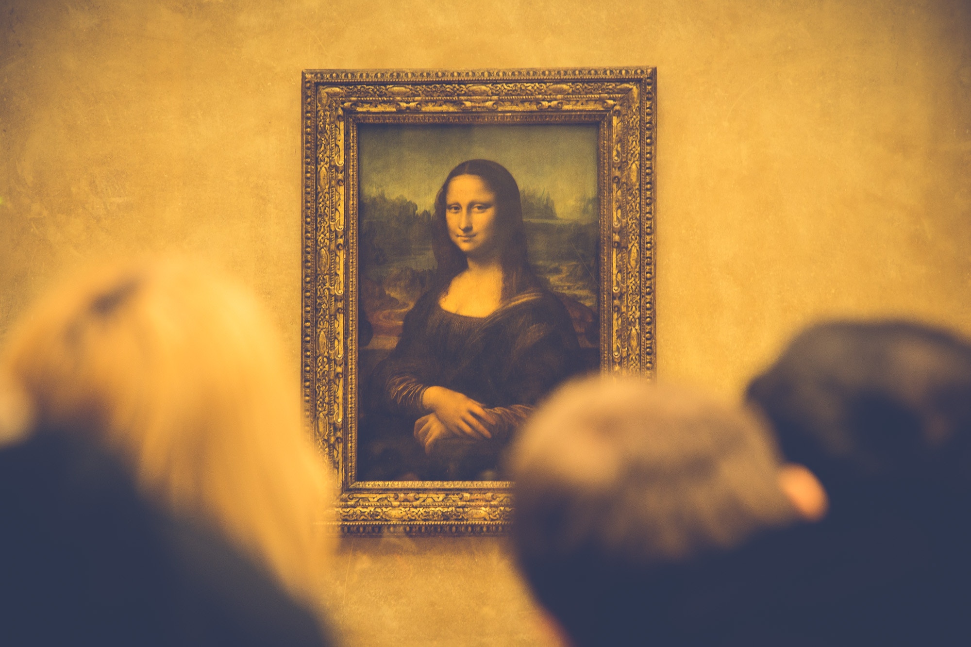
This is true for everyone that creates: from Leonardo Da Vinci to Evernote’s design team.
To Create Something Beautiful and Meaningful Requires Going Beyond the Surface
Walter Isaacson — who’s best known for biographies on historical innovators like Steve Jobs, Benjamin Franklin and Einstein — discovered in his Leonardo Da Vinci biography that Da Vinci had quite the obsession with the human anatomy.
Weird. Why in the world would a painter be at all concerned bones and organs? I mean, have you seen his drawings of the human fetus?
Well, for Da Vinci, having a deep understanding of our biological composition was useful for his art. His portraits, for instance, benefited from the deep mechanics around how eyes move and lips smile. It was the secret behind his insanely realistic human depictions, such as a The Mona Lisa.
And so, as I read about Evernote’s brand refresh, I wasn’t surprised to learn that the design process didn’t start with a logo, or colors, or typography.
It started with a question.
“What is our purpose?”
“What do we stand for?”
A Brand’s Mission Statement is Its Flesh and Bones
Like Da Vinci, the greatest artist in human history, Evernote didn’t jump straight to visuals, they started at the “flesh and bones” of the company: it’s mission and brand values. The brand refresh announcement on Medium summed this up perfectly:
“It’s easy to write a lofty purpose and inspiring mission statement. To fall in love with powerful words or a flashy new logo. But what’s challenging throughout the process of a redesign is remembering why you started down the path.”
The team describes re-establishing their mission statement, and being honest about what it really was. Through that process, everything from changes to the logo mark, to illustrations and textures, to typography became clear and informed.
The same way Da Vinci’s portraits benefited from understanding skulls and veins, Evernote’s brand refresh benefited from an understanding of the company’s roots and core vision.
“We liked the sophisticated literary feel of a bold serif font which, incidentally, offers another nod to our past and a connection to our founder, Stepan Pachikov, and his belief in the importance of digitizing the written word.”
The final result of the brand refresh, at least as far as the elephant logo mark goes (also known as “mod”), was incremental at best; It wasn’t as jarring or as stark as the brand redesigns of Uber, Instagram, and Airbnb.
That said, the most valuable asset of the brand refresh was a renewed awareness and deeper understanding and expression of the brand, which is more important than ever.
The weight of today’s brands are no longer, and arguably have never, been placed solely on a logo mark. Rather, a brand is the representation and consistency in which a customer interacts with a company.
From (as Evernote puts it) “the simplest email to our most important brand asset: the product itself.”
And by stepping through a process that acknowledges that, even though the refresh itself is unnoticeable, I’d go as far as to call the brand refresh is a piece of art.
–
Originally published here.

